Masonry is a grid layout based on columns with auto-placement, but without sticking to a strict grid for the rows. Unlike other grid layouts, it doesn’t have a fixed height of rows. Basically, Masonry layouts optimize the use of space inside the web page by reducing any unnecessary gaps.
The most well-known example of the Masonry layout is Pinterest, and you will sometimes hear people refer to the layout as a “Pinterest layout”.

Practical uses of Masonry Layout
Masonry Layout with Site Studio
Creating the Masonry layout in Site Studio with multiple options for the content editor or site manager offers an innovative way to display content. We have created a Masonry layout in Site Studio using plain CSS without JS or any JS library so that it will not impact the website’s performance.
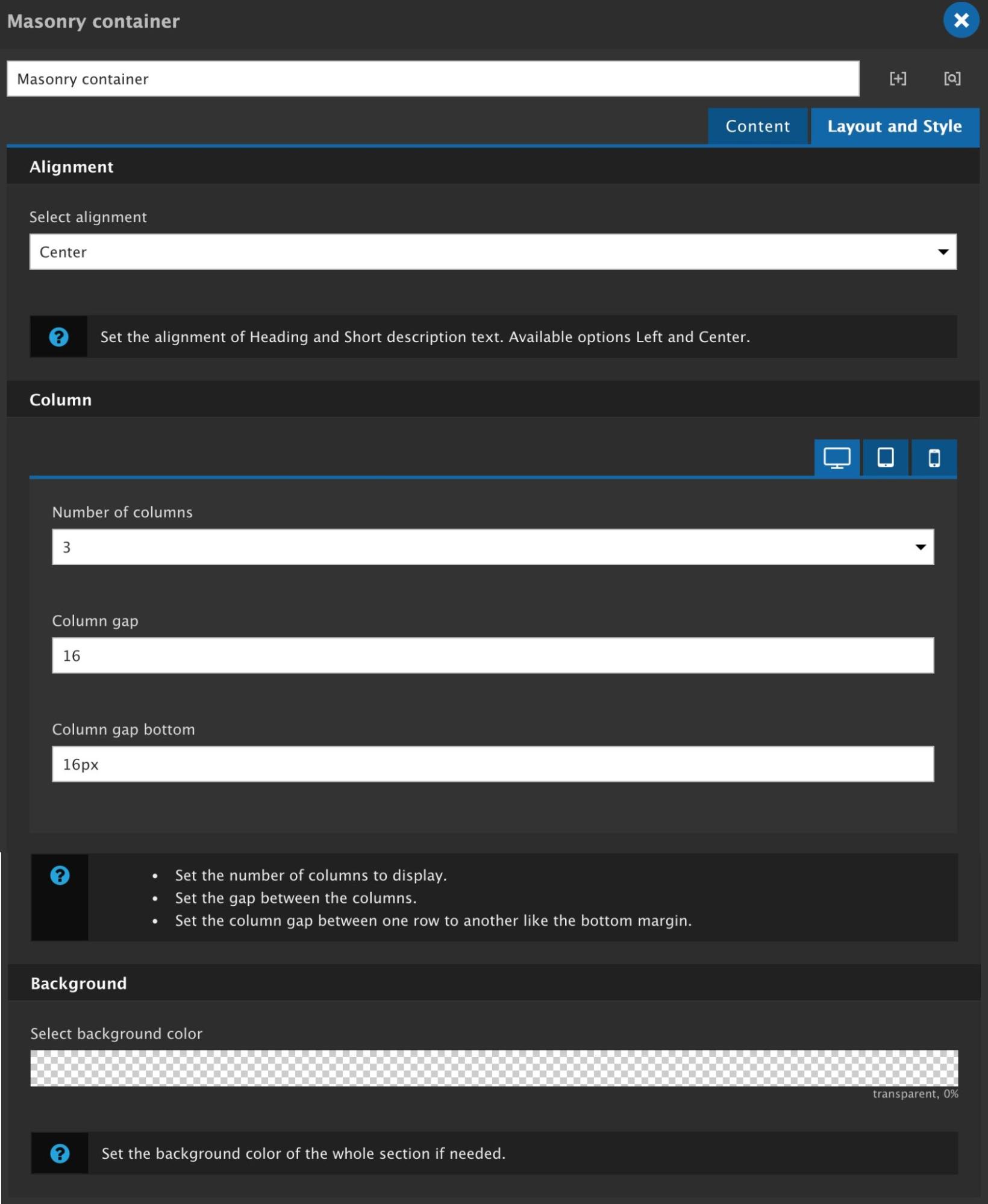
The Masonry component in Site Studio will be available for the content editor/site manager with the following settings/configurations:
Approach
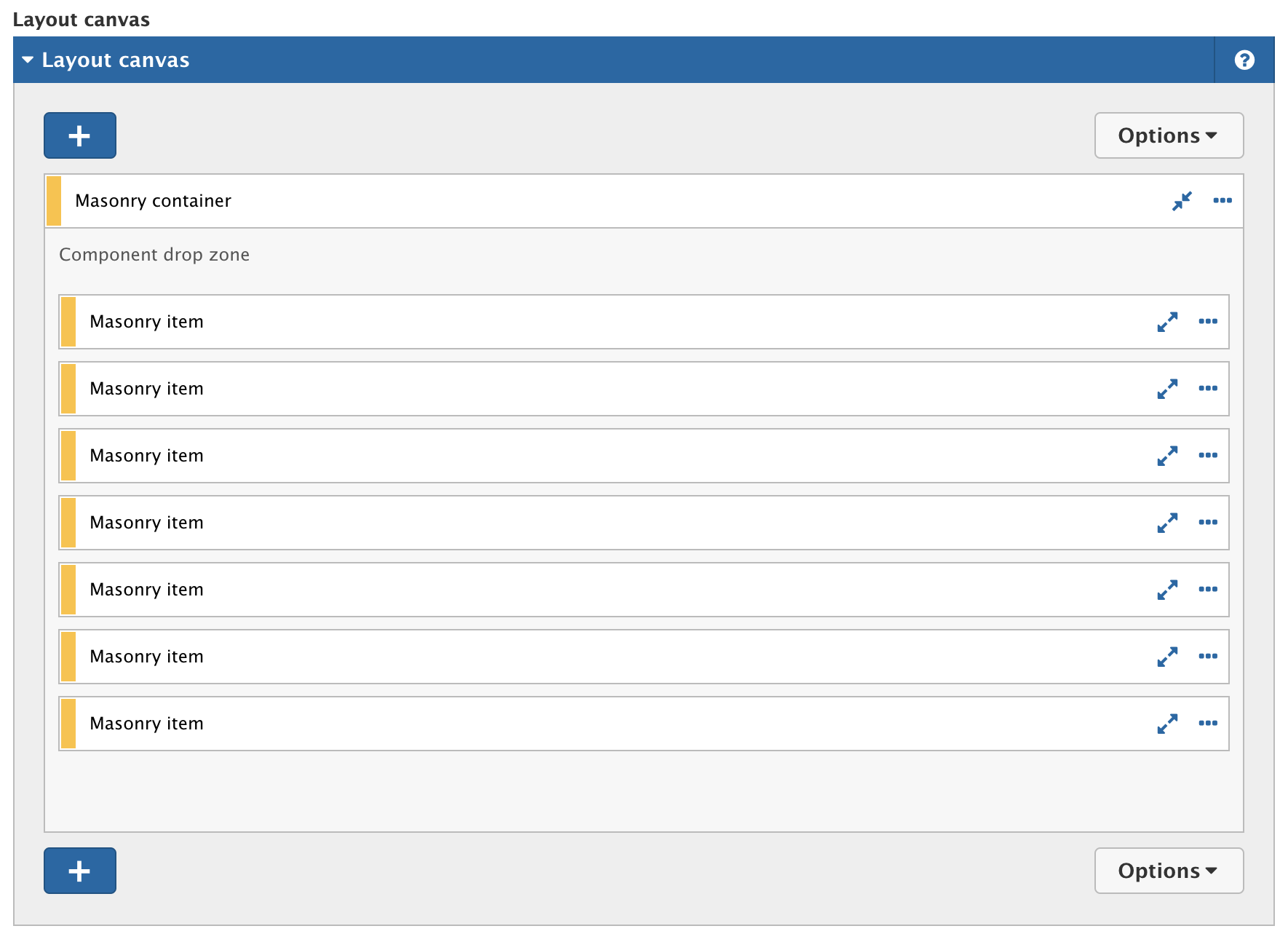
To achieve this we need two components:

By navigating Site Studio > Components > Components > + Add components (admin/cohesion/components/components) you can create/add new components.
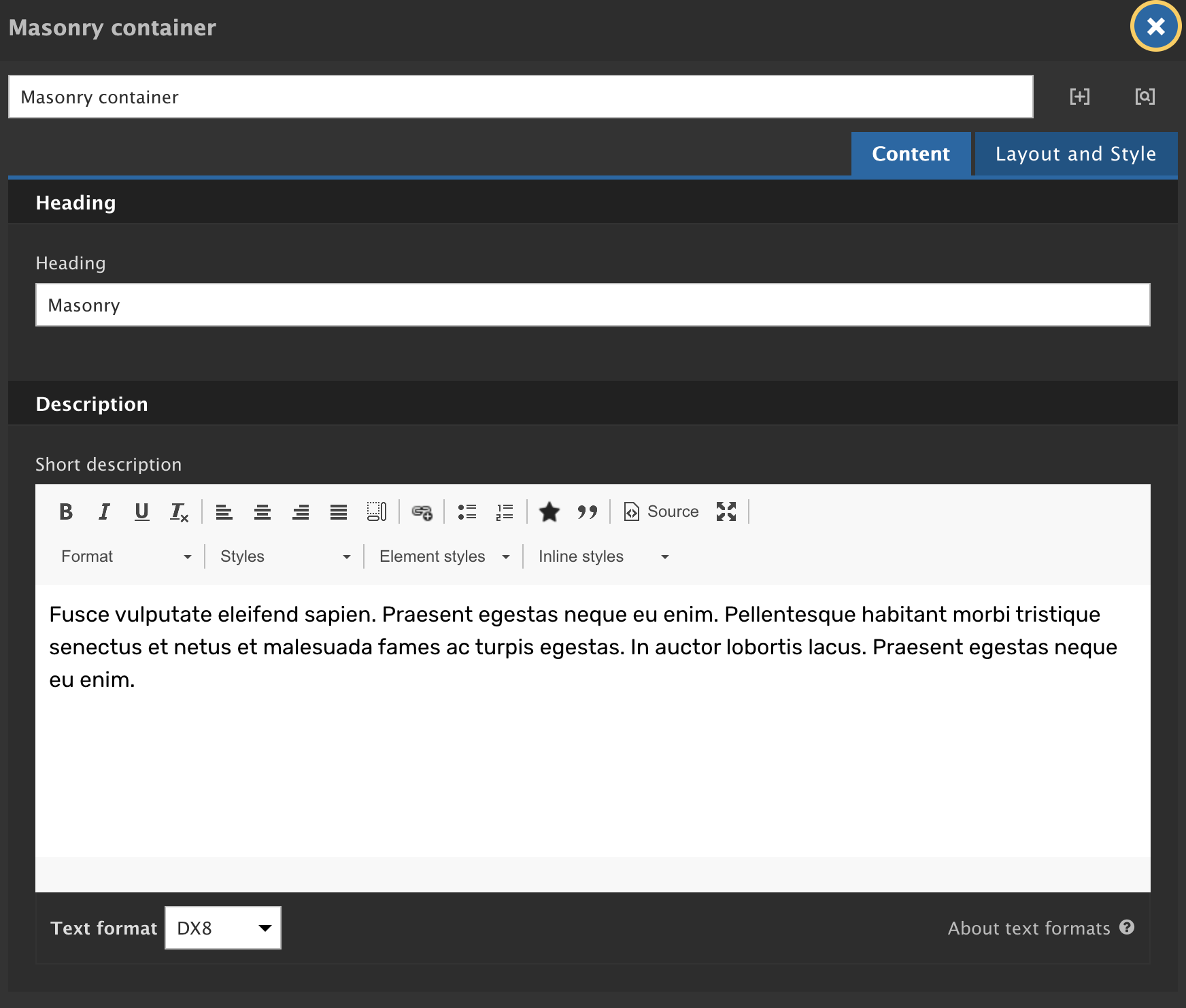
Masonry container
This is how it will look:
Content tab
Layout and style tab
Masonry item
Note: Always better to keep one card component or one image component in one Masonry item so that it will work as expected.
Here’s is how it will look:


Result
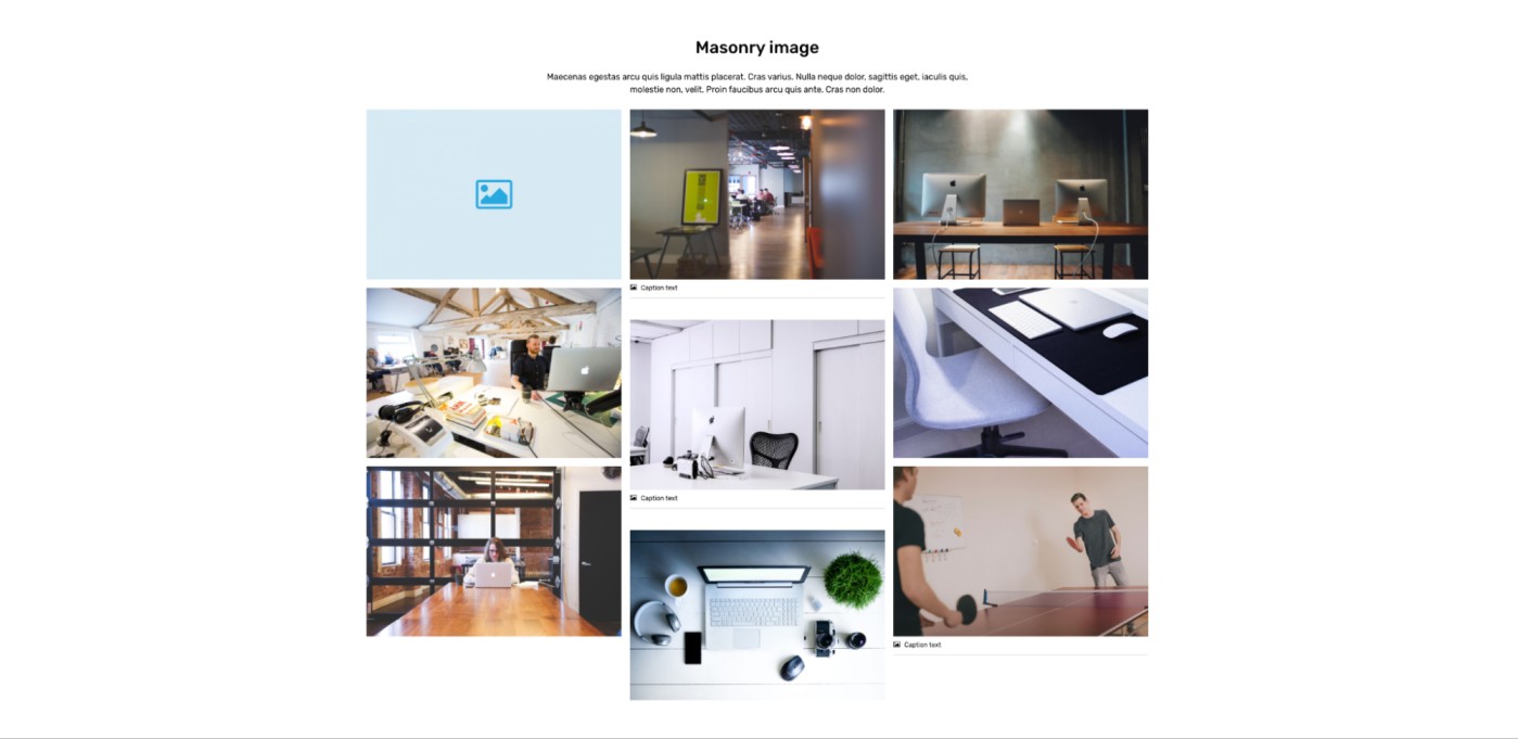
With the above combination both Masonry layouts will look like this:

Conclusion
Thank you for reading and we hope this blog was helpful. Here's a ready Masonry layout that you can download and import the package to your Site Studio instance - https://github.com/qed42/masonry-layout.