This blog is a tutorial for setting the mobile menu (Hamburger menu) in Acquia Site Studio which was earlier known as Cohesion DX8. Converting the desktop horizontal dropdown menu to a Hamburger menu in mobile delivers the best UX for mobile users.
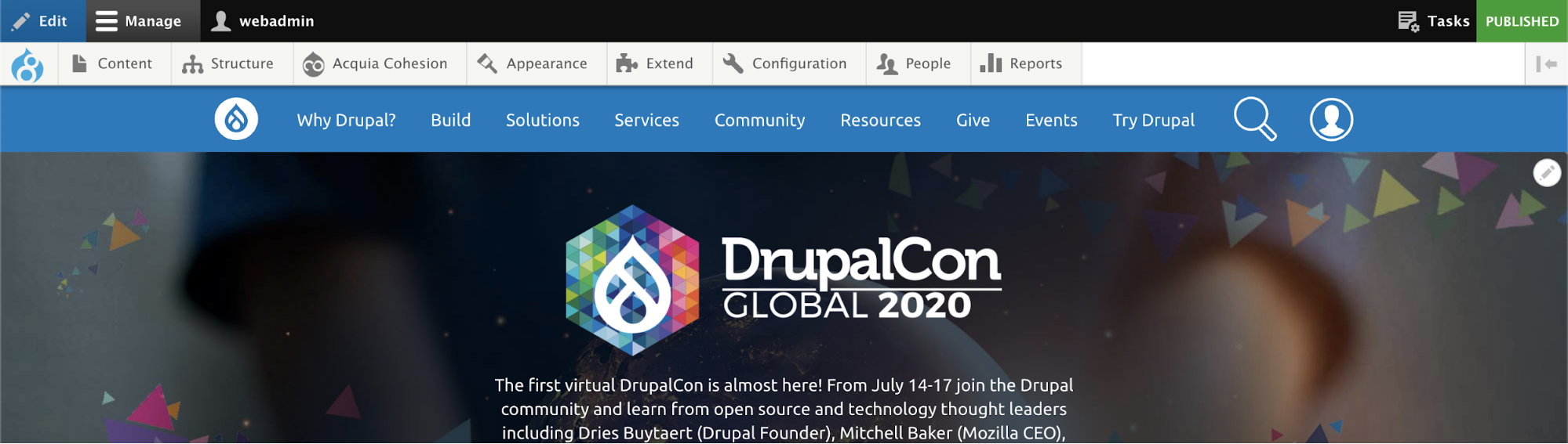
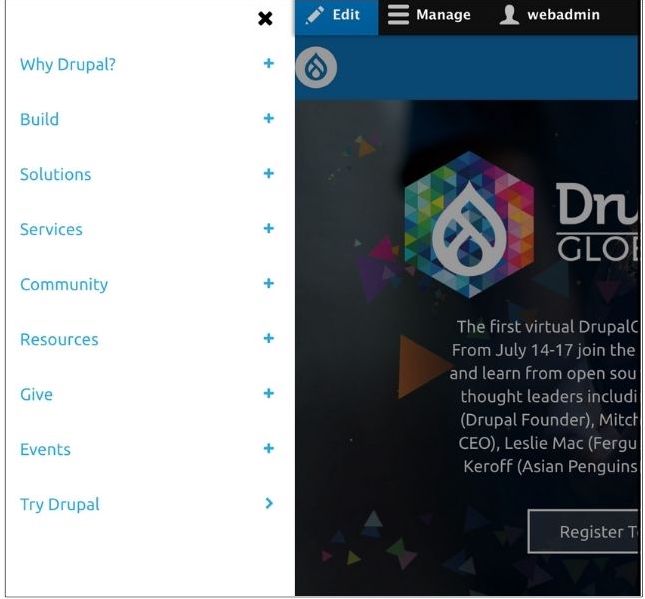
Here is a screenshot of the desktop and mobile menu which we now implement with Acquia Site Studio.
Desktop Menu
Mobile Menu (Hamburger Menu)

There are many ways to achieve the hamburger menu.
But here in this tutorial, we will see how to implement the hamburger menu with Acquia Site Studio without writing a single line of code and without using any external library or module. Everything is achievable through Site Studio’s core elements.
Here, I would like to take a reference to one of our previous Cohesion blogs, where the menu template has been explained. For quick reference, adding a below screenshot of Menu Template, using which we could easily implement above mentioned Desktop Menu with dropdown level.
After creating this template and applying a few styles, the Desktop menu with dropdown would work flawlessly. But when viewed on mobile devices, it won’t appear perfect.
Now, let's look at all the things which should be taken care of while converting a desktop menu to a mobile hamburger menu.

To cover the whole structure, we need to convert the above-mentioned Menu template and add a few Site studio core elements as shown in the screenshot below.
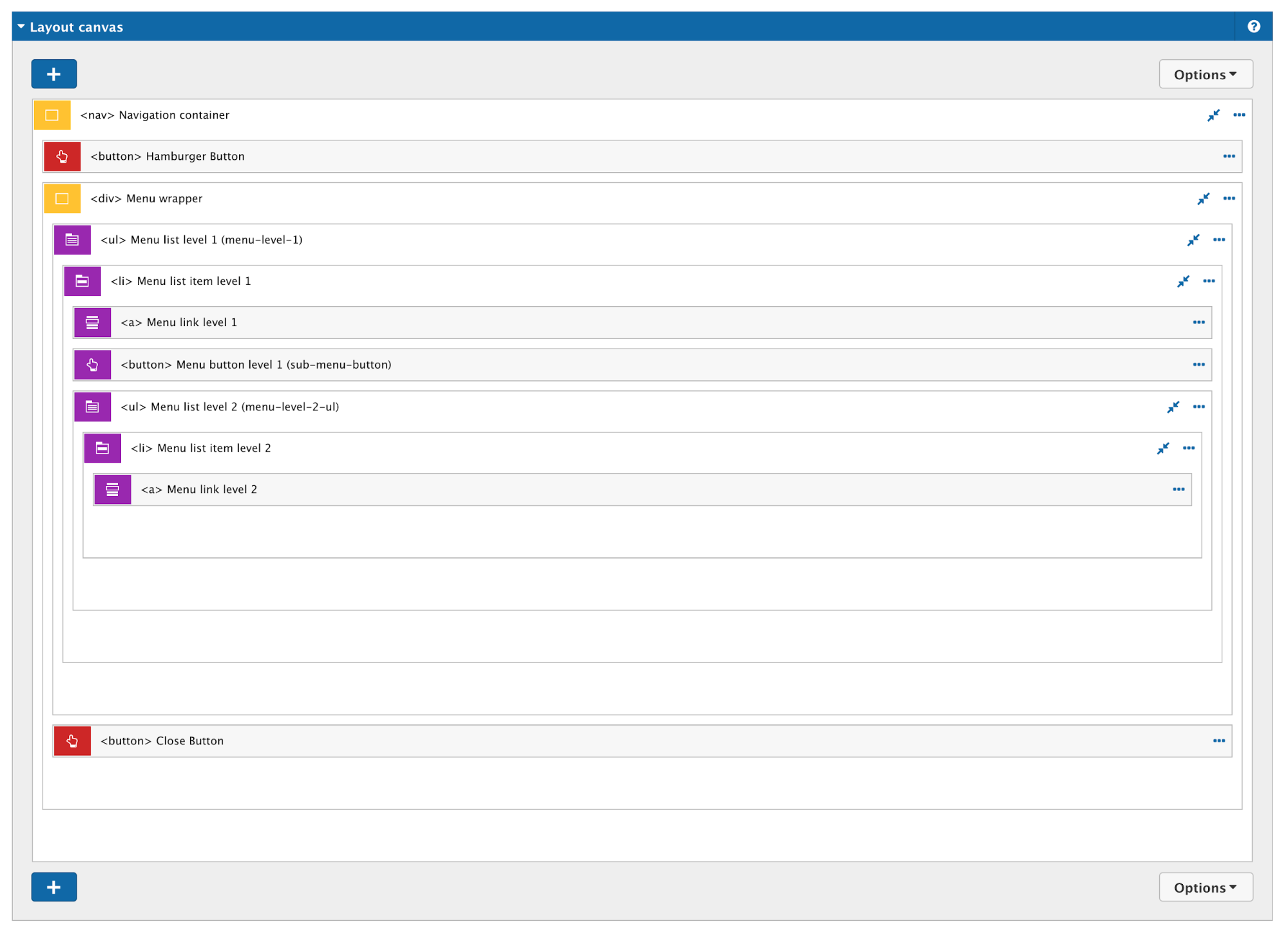
Now, let’s compare and look at the new elements added in the Menu template.
List of elements added:
Navigation Container
This container is for holding the whole structure of the menu and also to apply a few of the styles and add some modifiers through button elements.
Hamburger Button
As mentioned in the above point, the button is helpful to add/remove/toggle modifiers to the menu structure and also to toggle the view of the whole menu.
Adding a screenshot of the hamburger button configuration which will help you understand the modifiers added and how the menu toggling has been achieved.
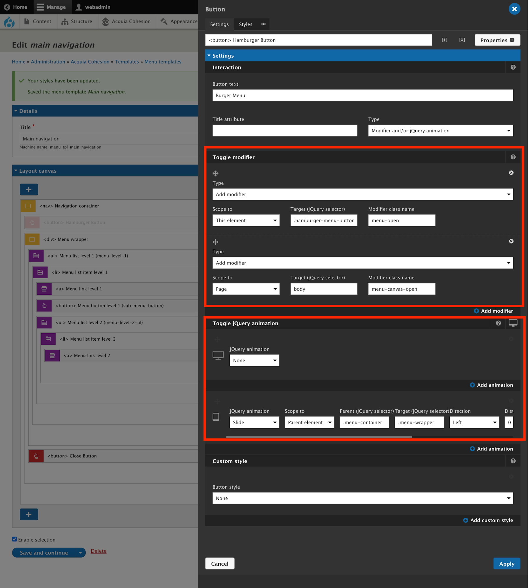
Here we need to take care of two sets of configurations:
As displayed in the above image, we need to add modifiers for elements of the page:
Moreover, Toggle jQuery animation needs to be configured.
Menu Button Level
Now, let’s move to the next element i.e. <button> Menu level 1 (Sub menu visibility toggle) and refer to the screenshot below:
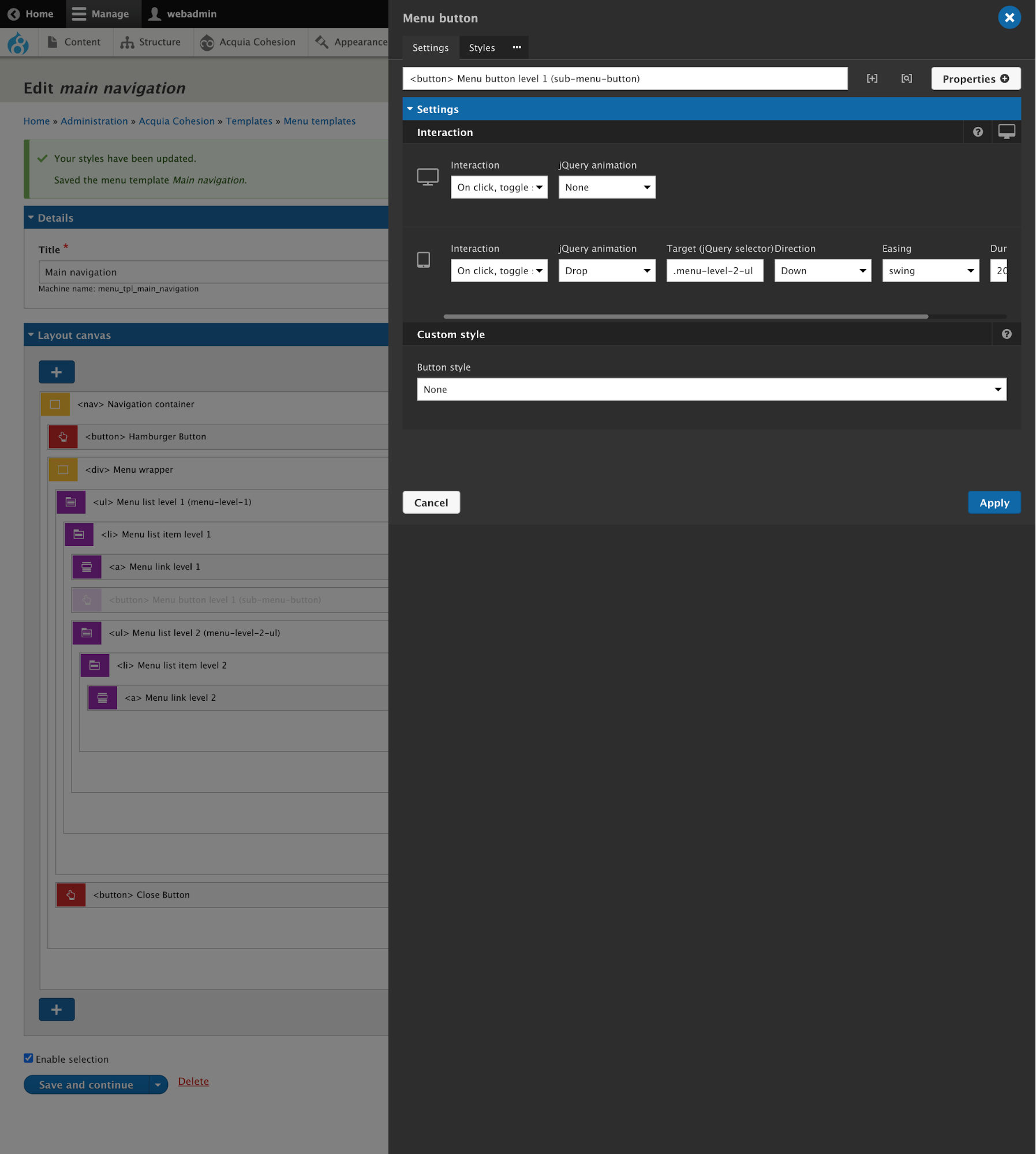
As per the screenshot, it can be seen that for desktop breakpoint no interaction is required and for the tablet breakpoint, we need to set the interaction for toggling the dropdown.
Close Button
This button will be to remove a few modifiers and also the Menu Drawer will be closed. Below is the screenshot for Close button configuration.
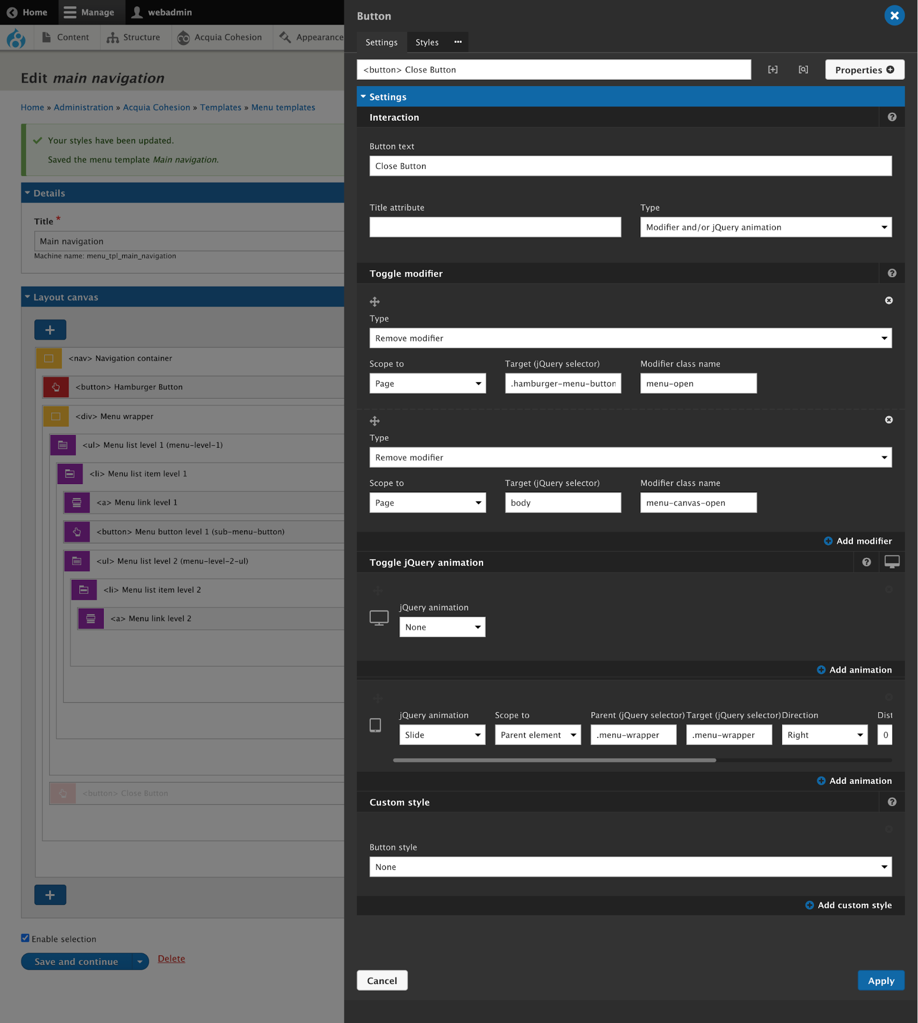
Basically, we need to exactly reverse what we have implemented for the Hamburger menu button. So, it means, we need to remove the modifiers and jQuery toggling animation which have been added through the hamburger menu button.
By following the above steps, you would be able to create the mobile hamburger menu. Few CSS needs to be implemented for a couple of basic things which can be implemented through the Menu container styles’ properties.
For any queries, you can drop your questions in the chat below or you can catch me on Twitter @qed42.