Snackbars are an essential part of modern web applications. They provide quick, at-a-glance feedback to users, often informing them of the success or failure of an action.
However, when searching for libraries in React or Next.js to create snackbars, we often encounter heavy component libraries that can lead to performance issues or outdated libraries built with older versions of React.
In this blog post, we’ll walk through how to create a custom Snackbar component using Next.js 14, TypeScript, and Tailwind CSS that is customizable and lightweight.
Prerequisites
Setting Up Next.js 14 with TypeScript and Tailwind CSS
First, let’s set up a new Next.js project with TypeScript. If you haven’t already done so, you can create a new Next.js project with the following commands:
Install the necessary dependencies:
classnames is is used for conditional class management. If you prefer, you can use the ternary operator to add conditional classes instead. react-icons is used to include the close icon inside the snackbar.
Now, let’s configure Tailwind CSS. Follow the official Tailwind CSS installation guide for Next.js.
Creating the Snackbar Component
We’ll start by creating a Snackbar component and its context. This component will be responsible for displaying messages to the user.
Step 1: Create a Context:
Create a new file called SnackbarContext.tsx in the context directory.
Here, we define the types for the snackbar context and provider props. SnackbarContextType defines the shape of the context function, and SnackbarProviderProps establishes the shape of the provider's props. SnackbarState represents the state of the snackbar.
Step 2: Create the SnackbarProvider Component:
Define the SnackbarProvider component to provide the snackbar context to its children.
In this component, we use useState to manage the snackbar state. The showSnackbar function displays the snackbar with a message and variant. The handleSnackbarClose function hides the snackbar.
Now, To automatically close the snackbar after some time, we’ll add a timeout. We can use setTimeout inside the showSnackbar function to trigger the close function after 5 seconds.
It will now close the snackbar after 5 seconds. However, if we open a second snackbar within those 5 seconds, the timer for the second snackbar won’t reset.
For example, if we open a success snackbar, the timer is set to close it in 5 seconds. If we trigger an error snackbar 3 seconds later, the snackbar content and variant will change, but it will close in the remaining 2 seconds.
To solve this issue, we use useRef to store the timer and clear it if another snackbar opens before the 5 seconds timeout. This ensures the timer resets each time a new snackbar is triggered. Here’s the updated code:
Step 3: Create a Hook to Use the Snackbar Context:
Define a hook to use the snackbar context in other components.
This hook ensures that the context is used within a SnackbarProvider.
Here’s the final SnackbarContext.tsx file:
Using the Snackbar Context in Your Application
Now that we have our Snackbar context and provider, we can use it in our application. Wrap your application’s layout component with the SnackbarProvider like this:
Adding Tailwind CSS Styles
In your tailwind.config.js file, add this line in the content array to apply the tailwind classes in snackbar component.
Add custom styles for the snackbar:
Triggering the Snackbar
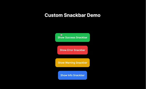
You can now use the useSnackbar hook to trigger the snackbar from any component. I'm using the code from this demo project as an example here:
Conclusion
In this blog post, we’ve created a custom Snackbar component in a Next.js 14 application using TypeScript and Tailwind CSS. By following these steps, you can easily provide users with feedback on their actions, enhancing the overall user experience of your application.
Check out the production deployment here.
You can find the complete source code on my GitHub repo.
That’s it for this guide. See you next time, and if you found this guide helpful, please leave a like 👍. Happy coding!