Drupal’s new Experience Builder (XB) is changing how teams create and manage content. It gives editors and developers a shared, visual interface to design pages quickly, without writing code.
In this blog, we’ll explain what Drupal’s Experience Builder is, how it’s different from Layout Builder, and why its Code Components are becoming a key part of modern Drupal development.
What is the Drupal Experience Builder?
Experience Builder is Drupal’s next-generation visual page builder. It helps non-technical users create, edit, and manage pages using a simple drag-and-drop interface.
It’s built around a component-based system, so every part of a page — a banner, a card, or a section — can be reused and customised visually.
This tool is part of Drupal’s Starshot Initiative, which focuses on making site building faster, easier, and more consistent for teams.
Essential features of a modern Experience Builder
Drupal Experience Builder vs. Layout Builder: what’s the difference?
While both tools help shape page layouts in Drupal, Layout Builder and Experience Builder serve different goals.
Layout Builder focuses on structuring content types. It’s built for developers and site builders who define layouts that apply across similar pages, such as all blog posts or articles. It’s backend-focused and block-based, which gives it precision but limits flexibility for non-technical users.
Experience Builder, on the other hand, is designed for editors and marketers who want more visual control. It lets users build full pages through a drag-and-drop interface and see updates instantly. Instead of relying on Twig templates and PHP blocks, it uses modern React-based Code Components that can be customised and reused across pages.
In short, Layout Builder defines the structure; Experience Builder defines the experience. It takes Drupal’s structured approach and adds a modern, component-driven workflow that feels faster, more visual, and more flexible.
Experience Builder (XB)
Experience Builder allows content editors to visually build and manage pages using a drag-and-drop interface. This means editors don’t need to write code to create or change page layouts — they can do it all visually and easily.
Code components in XB: build UI with React & Tailwind
Code Components are fully customizable building blocks in Experience Builder (XB) that allow developers to create reusable UI elements using React, JSX, and Tailwind CSS.
They are built using Drupal’s Single Directory Components structure, which keeps markup, logic, and styles together for better maintainability.
While these components are coded by developers, they are designed to be user-friendly for content editors, who can drag and drop them into pages, configure props, and manage layout without writing any code.
Why use Code components?
They enable developers to define the structure, style, and configurable options (props and slots), making UI elements reusable and consistent. Content editors can visually manage and customise these components without needing to write code, speeding up page creation and ensuring design consistency across the site.
Common use cases include:
Note: Before creating Code Components, make sure Experience Builder (XB) is set up and ready to use on your Drupal site. Once everything is ready, you can start building components easily inside the builder.
Currently, XB supports only the Article content type.
Key benefits of adopting the Experience Builder
A developer’s deep dive: how to create reusable code components in Experience Builder
1. Create an article node
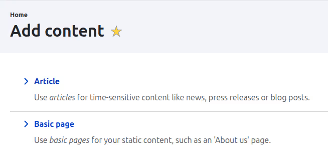
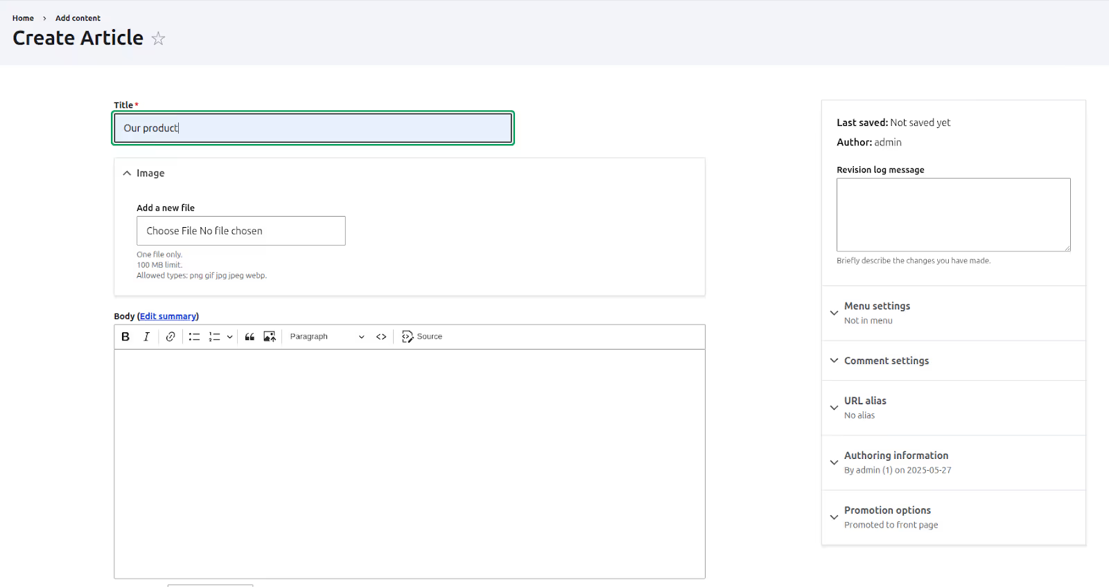
2. Access the Experience Builder editor
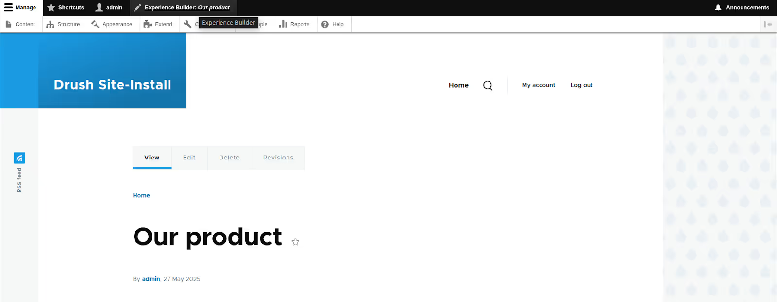

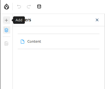
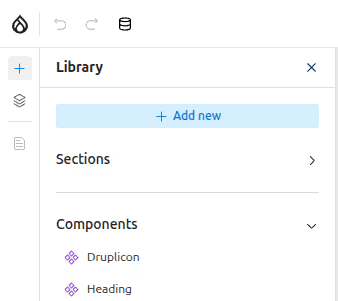
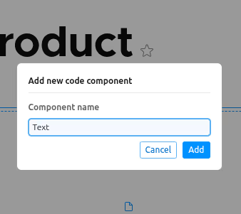
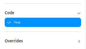
3. Create a “Text” Code component
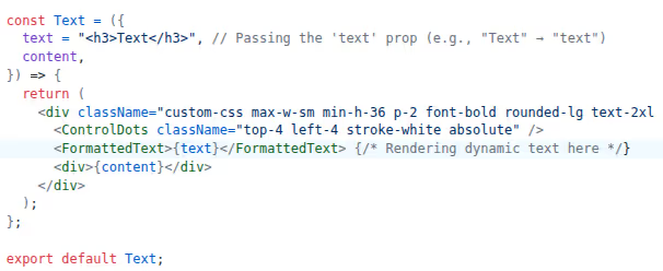
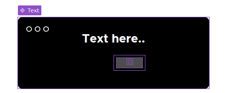
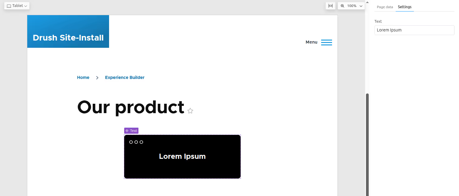
Now, we will create a new Code Component called “Text”. This component will display text on the page. Later, we’ll make it editable so content editors can change the text directly in the Experience Builder without writing any code.
4. Component implementation
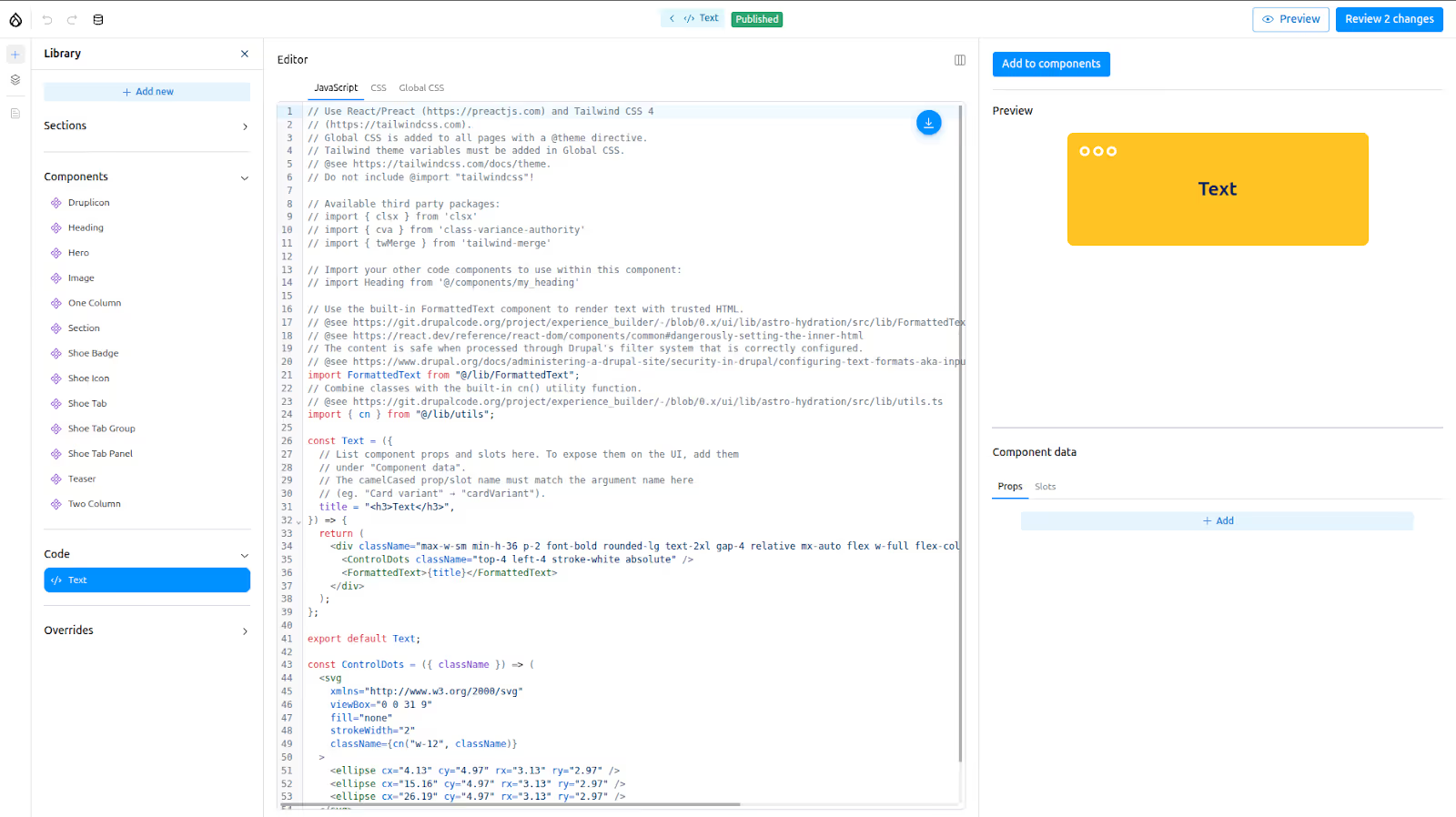
It uses React with Tailwind CSS. Currently, React version 18.3.1 and Tailwind CSS v4 are included.
You don’t need to import Tailwind manually — it’s already included globally.
Some helpful packages are pre-installed — 2 built-in and 3 third-party packages. Currently, only these packages are available for use.
Built-in packages:
Third-party packages: clsx, class-variance-authority (cva), tailwind-merge (twMerge)
Understanding the default code:
At this point, your component is static — it always shows the same text, and there's no way to customise it from the UI.
Making the component dynamic with props
Now, let’s make this component dynamic!
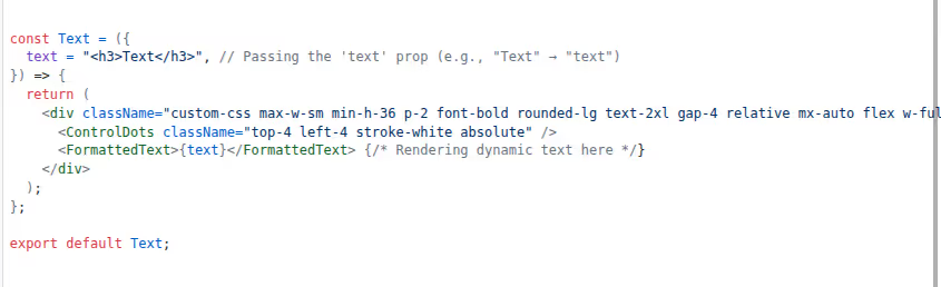
To do that, we’ll use props — dynamic inputs that allow you to customise the component’s content and behaviour from the UI.
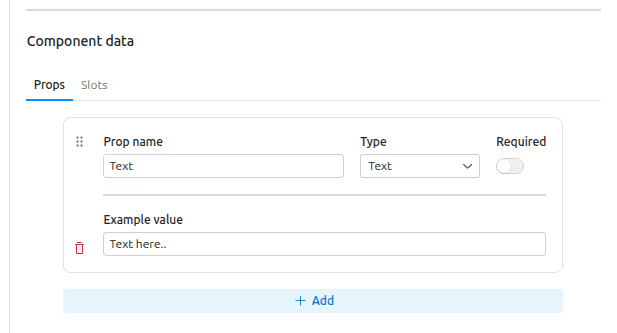
By adding props to your component and defining them under "Component data", these inputs will appear as editable fields for your component in the Experience Builder interface.
For example, if you expose a text prop, editors will be able to enter custom text directly from the UI while placing the Text component.
We can add any type of prop as needed — text, image, boolean, and more — based on the kind of content we want editors to customize. For our example, I’ll add a text-type prop to make the Text component dynamic and editable.
For our Text component, we will:
Note: The camelCased prop name must match the argument name in the component. (e.g., "Card variant" → cardVariant)

Using slots to add more content
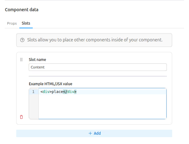
Besides props, Code Components also support slots. Slots are special placeholders inside a component where editors can add other components or content.
For example, a "Card" component can have slots for the header, body, and footer. Editors can easily drag and drop content or other components into those areas.
We take slots as inputs just like props, and render them inside the component to allow placing other components.
Styling and CSS tabs
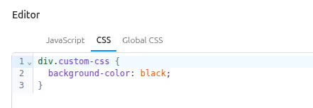
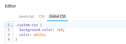
Some Tailwind classes are added inline in the component markup. You can directly apply Tailwind v4 classes this way.
There are also two CSS-related tabs available:
Important notes:
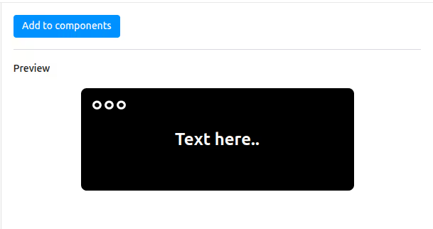
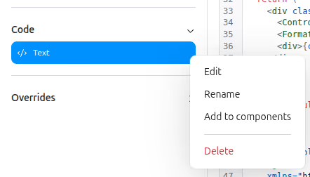
Adding the created Code components to the component list
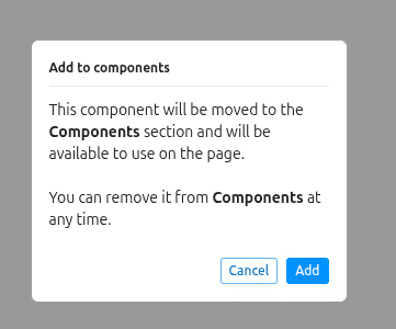
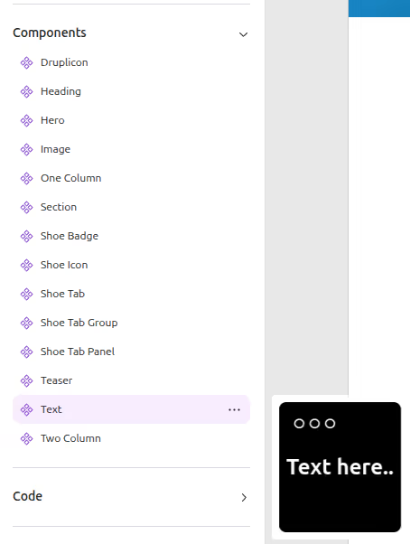
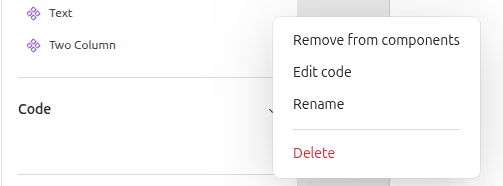
5. Code components: save, export & import
6. What makes Code components different?
Code components
Normal components (Drupal way)
Wrapping up
Code Components are just one part of how Experience Builder is changing how teams build in Drupal. What used to require multiple files, overrides, and backend coordination can now be done directly in the browser. It's faster, cleaner, and creates less back-and-forth between developers and editors.
But this is just the beginning.
Some of us at QED42 are already exploring what happens when AI enters the mix. The xb_ai_assistant module, now available on Drupal.org, generates page templates by intelligently placing available Single Directory Components (SDCs) based on simple prompts. While it works seamlessly with the Starshot demo theme (try it out instantly!), It’s also compatible with any theme. Just ensure your SDCs include proper descriptions for AI-assisted placement.
The module assembles layouts in real time and supports contextual editing, letting you tweak individual components directly on the page. See it in action here: Taking GenAI in Drupal to the Next Level, where we showcase prompt-based layout generation in Experience Builder.
But it’s not just about layouts. We’re also rethinking design workflows. In this LinkedIn post, we explore how AI can generate Code components directly from Figma designs. By leveraging Figma’s MCP, developers can share a Figma link and automatically generate code-ready components, skipping manual handoffs entirely.
The direction is clear: faster workflows, tighter collaboration, and more intelligent building blocks. As Experience Builder grows, it’s not hard to imagine a future where building with Drupal feels more like shaping ideas in real time with code, content, and design all connected.
Start small. Try a Code Component. Or test what’s possible with AI. Either way, this is a good moment to rethink how you build.
FAQ's
Q: Is the Experience Builder part of Drupal core?
Not yet. It’s an evolving community project under the Starshot initiative.
Q: Does it replace the Layout Builder?
No. It builds upon it with a more visual, component-driven experience.
Q: Can I use it with my existing theme?
Yes. It works with themes that support modern component structures.